


How to Elevate UX with Energy Efficiency
100% of designers got this wrong 😱

Did you know energy efficient designs make for better user experiences?
In my previous newsletters, we spoke about what contributes to energy consumption and emissions and how designers can actually have an impact with digital design. If you missed this go back and check it out because it will help you understand what your role in this is and how to work with your engineering counterpart.
Here’s a refresher in case you forgot:
Components Designers Can Influence
1. Software
2. Design and development
3. Visual assets
4. Uploading and downloading
5. Data capture
I want to dive further into design implementation here. Let’s take a look at a recent poll I did on Linkedin. (Seen below)

73% of designers thought that a single page website would be more energy efficient. 27% thought multi page. Guess what, they were all wrong!
100% of designers who voted on my poll don’t understand energy efficiency. 😱
How is this possible? Well, it was a bit of a trick question on my part. 😅 I apologize. I know it was sneaky.

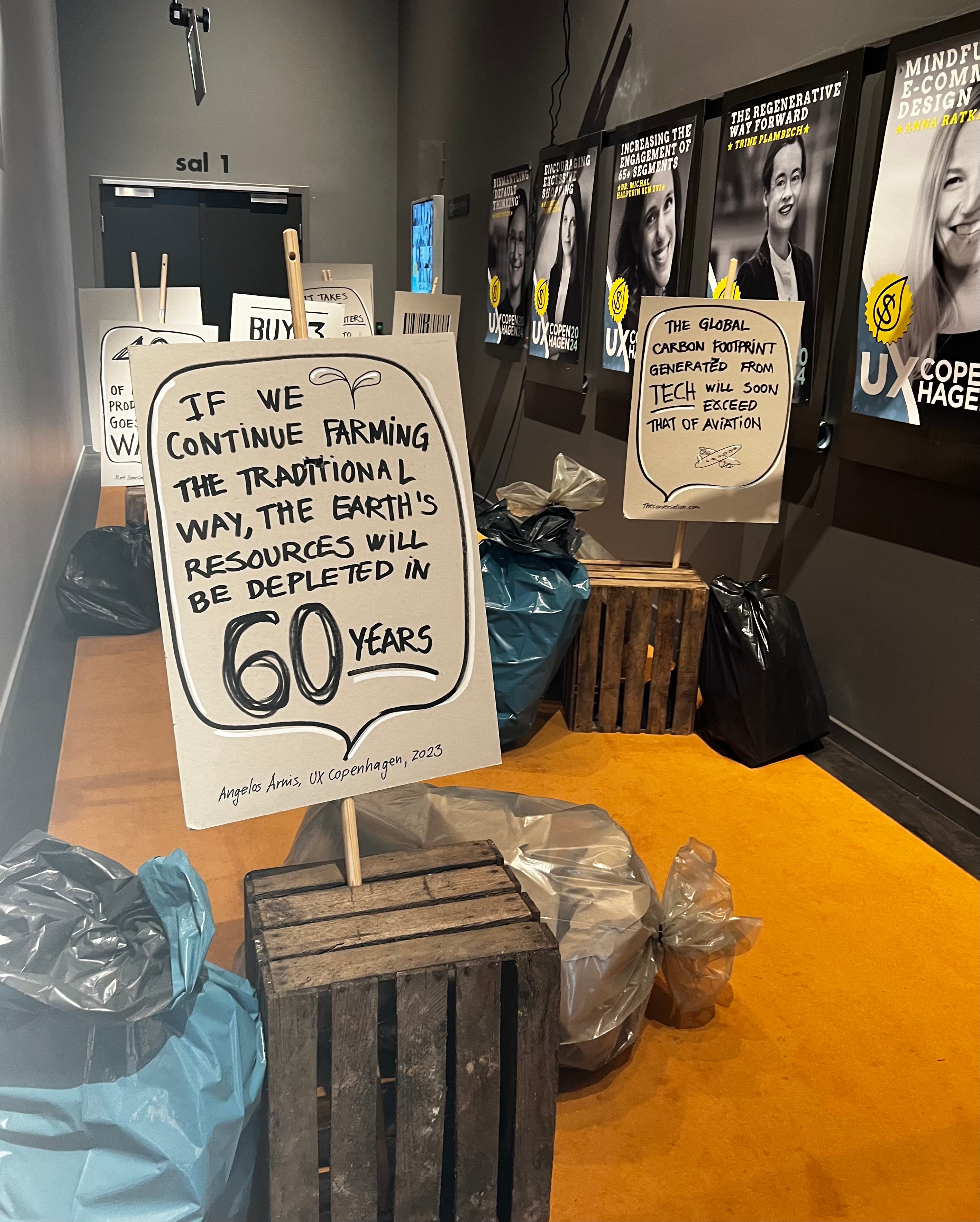
Here’s the thing, I spent the last week in Denmark at UX Copenhagen. The topic was degrowth and consumerism. Check out this crazy set design below. ⬇️ The entry way was lined with trash. 🗑️
💡 One of my biggest takeaways was that sometimes we're not asking the right questions. Instead of considering only the business goal or the user, zoom out and think holistically. Design is an ecosystem.
Design is complicated. The truth is there’s often no black or white answer, which is why YOUR design skills and critical thinking become so important.
How do you build an energy-first user experience ?
Benjamin was right when he said it depends on the page content. And Stacy was right when she said to optimize by the user experience and what information they need. This is also known as progressive disclosure.
💡 When we design for energy efficiency, we actually elevate the entire user experience.
Step 1. Design for an efficient user experience
In practice, design should be synonymous with efficiency. But for some reason 👀, every single one of us has come across a design that makes us want to swirl our brain around in our head.

I’m not even talking about energy efficiency at this point. I mean get the user from A to B in the quickest manner possible. Think progressive disclosure, avoid cognitive overload, time to completion, etc.
I recently reviewed one of my climate tech startup client’s sites because they asked me how to be more sustainable. 👏 I did an audit of their website and identified a bunch of issues, many of which were actually UX issues first that inadvertently contributed to this monstrosity of a website.
In this audit, I discovered why companies need designers. ☠️
I knew who the ideal customer profile was. This website did not speak to them. In fact, it probably confused them and turned them away.
Here are some of the main issues identified:
spoke to about 6 different customer segments, instead of the 1 they wanted to attract
technical content not geared towards the customer profile
too much writing
way too much information up front
no obvious way to get started aside from the contact email
repeated content
uninspired images
not optimized for conversions to customers
As designers who create portfolios, we know that what we put out is what we attract for jobs. Simple principle. The same goes for companies attracting customers.
Energy usage aside, this page was probably hurting the company more than helping it accomplish it’s goals. According to the Bureau of Labor Statistics, only 80% of startups survived after one year.1 Your website matters! Don’t squander it.
Set yourself up for success by creating the best user experience for your target customer to convert.
Go back to basics; create a user flow and consider what information is necessary at each point. Create a website outline. Ask yourself from the customer perspective what is necessary to get to your goal. Omit everything else.
Minimalist design is energy efficient. Now let’s consider the content that makes up the user experience.
Step 2. Optimize page content
You know what’s crazy, this website was probably the reason the icecaps are melting.
The average website is about 2.5 MB.
Their SINGLE PAGE WEBSITE was 13.14MB!!!2 Sorry I didn’t mean to yell, but the designer next to me and I literally screamed out loud. 😳 So no, single page websites are not necessarily more efficient. Lol.
If you thought to yourself, “was there a video on that page?” 👏 Good job you! You’re correct. (Video doesn’t have to be high in energy consumption. For comparison, the Craft’s site with video is 0.78MB.) There were A LOT more issues going on.
I’m not naming names, but I did come with receipts. 🤌
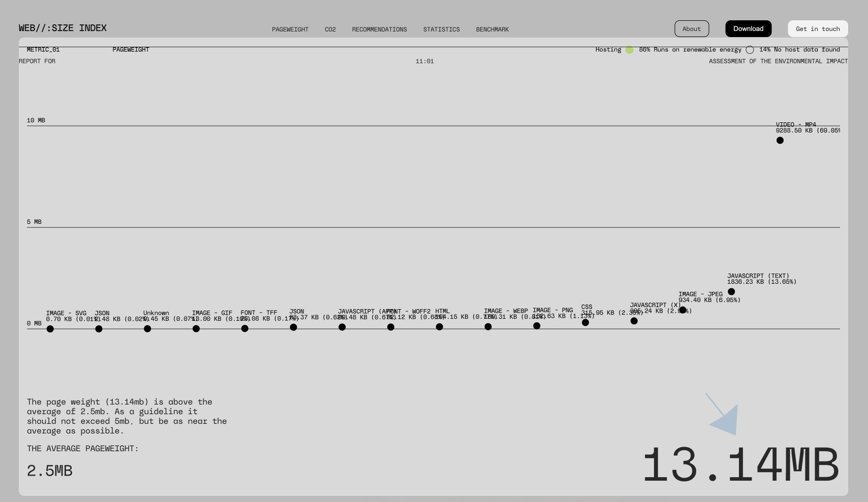
The seemingly innocent .mp4 → 9288.50 KB. 😮💨
Damn, these videos must be important? There are 3 videos on this page. One is almost 4 minutes long. Is it relevant to their customer? No, it’s a very technical video.
How do we fix this?
Keep reading with a 7-day free trial
Subscribe to Conscious Tech to keep reading this post and get 7 days of free access to the full post archives.